IKEA WebsiteRedesign
IKEA WebsiteRedesign
Could a product-management tool teach afurniture store some discipline within a12-hour long design sprint?

BRIEF
Redesign IKEA's website in another site's design language, picking one as far from IKEA's as possible. I chose Linear, a tool for product development and management. I had around 12 hours on my own to redesign one core flow, from the home page to the cart. I wanted to see how much a site changes when you change only a few of its components.
THE PROBLEM
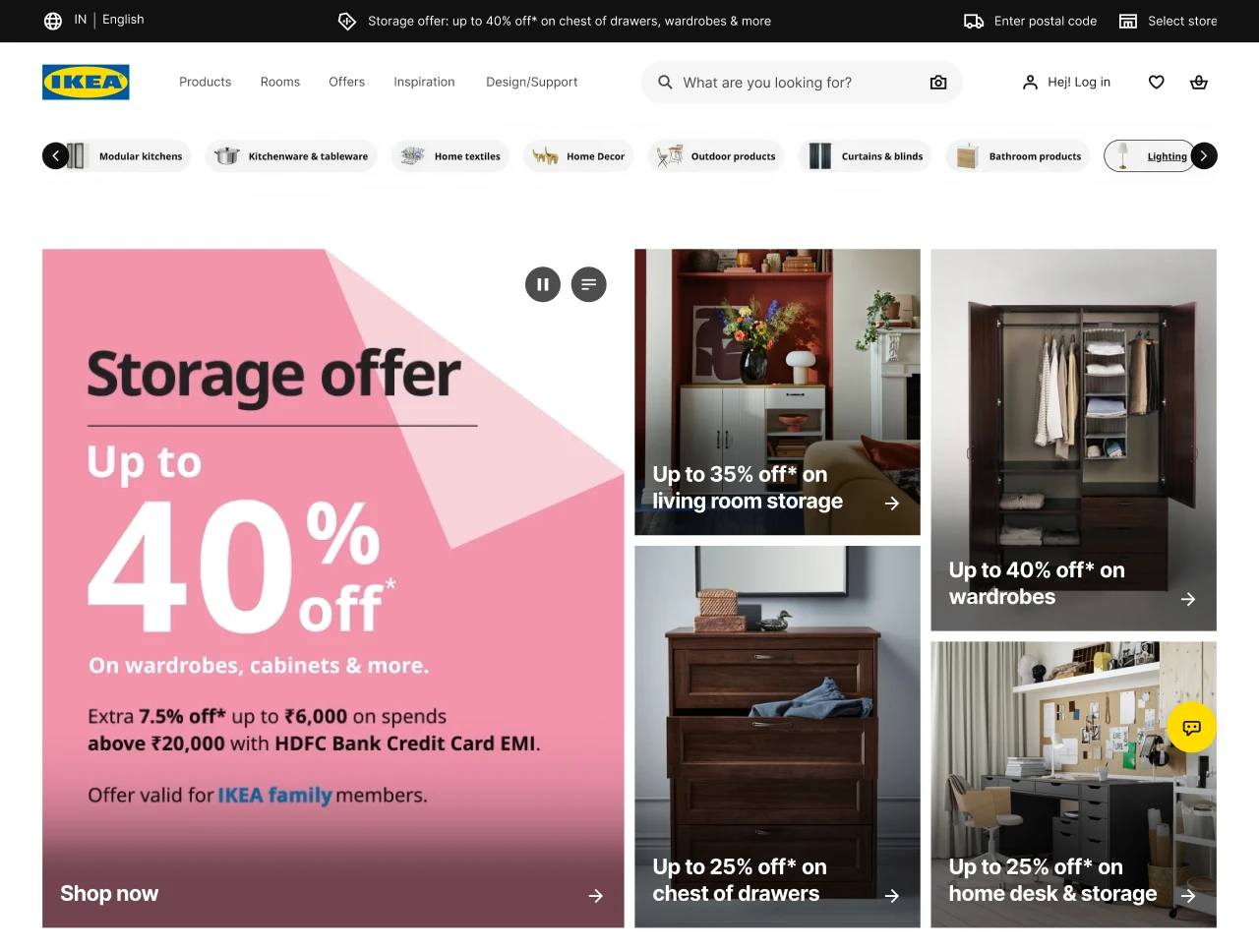
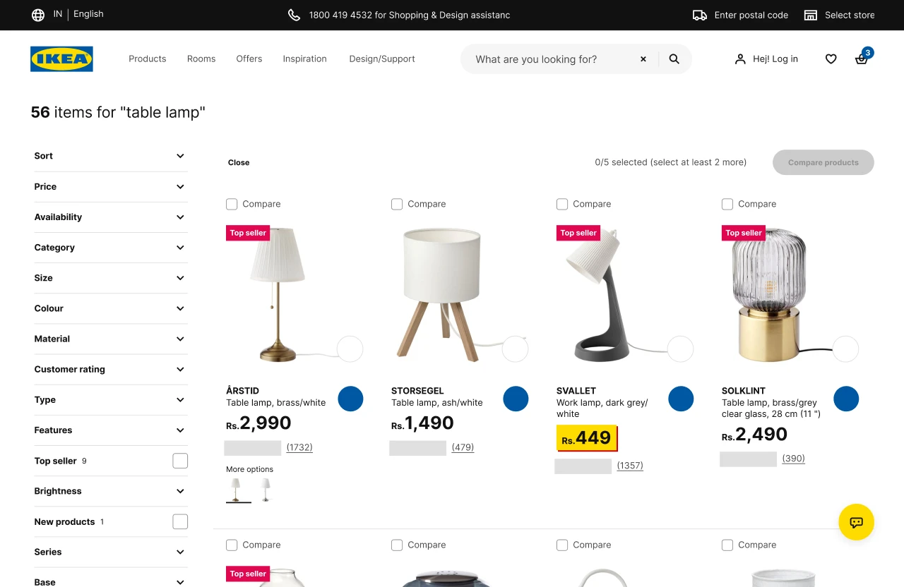
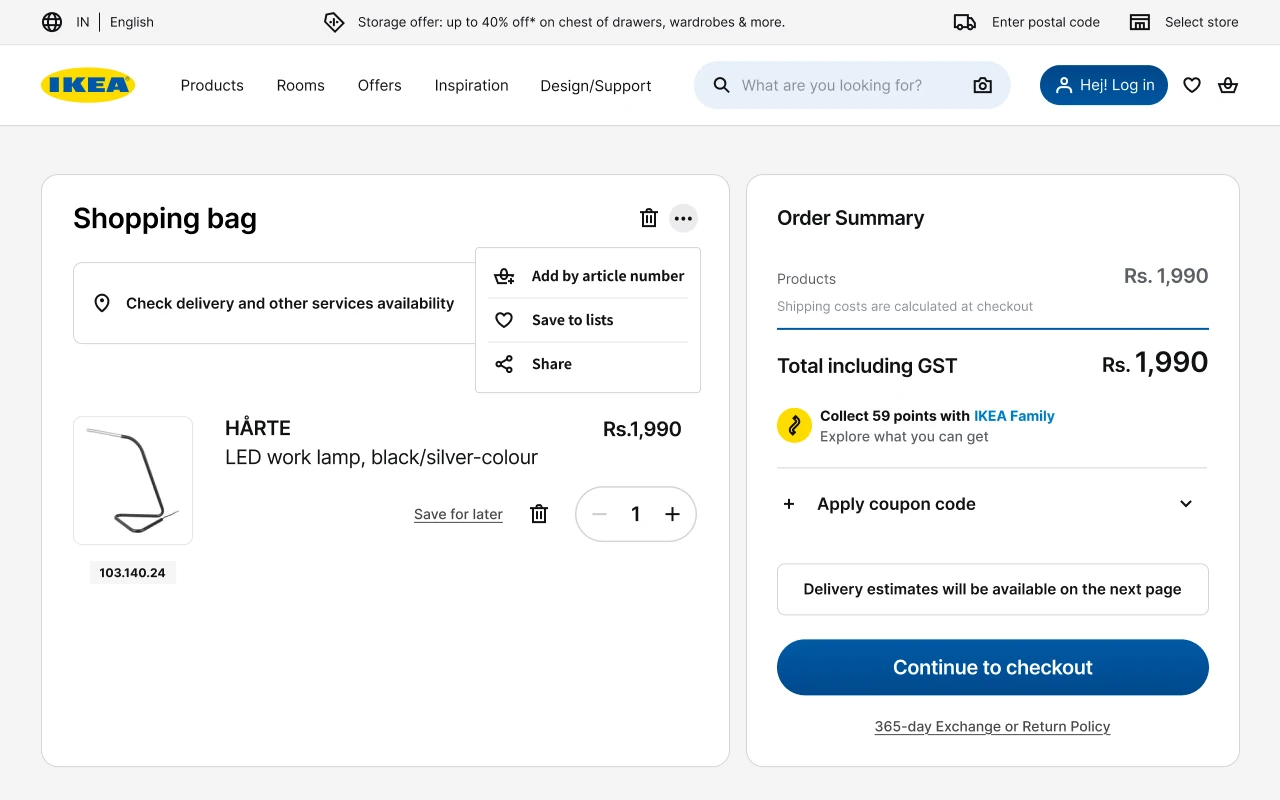
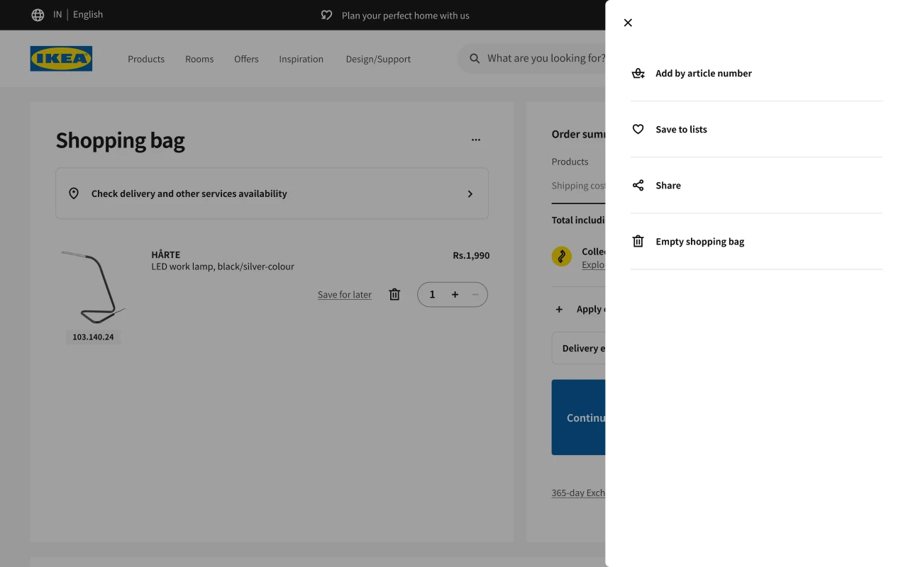
A heuristic review of the current site found crowded layouts, a hero with no clear focus, weak and poorly minimal add-to-cart buttons, and key cart actions hidden behind a menu. People could skip steps or misclick along the way.
THE REDESIGN
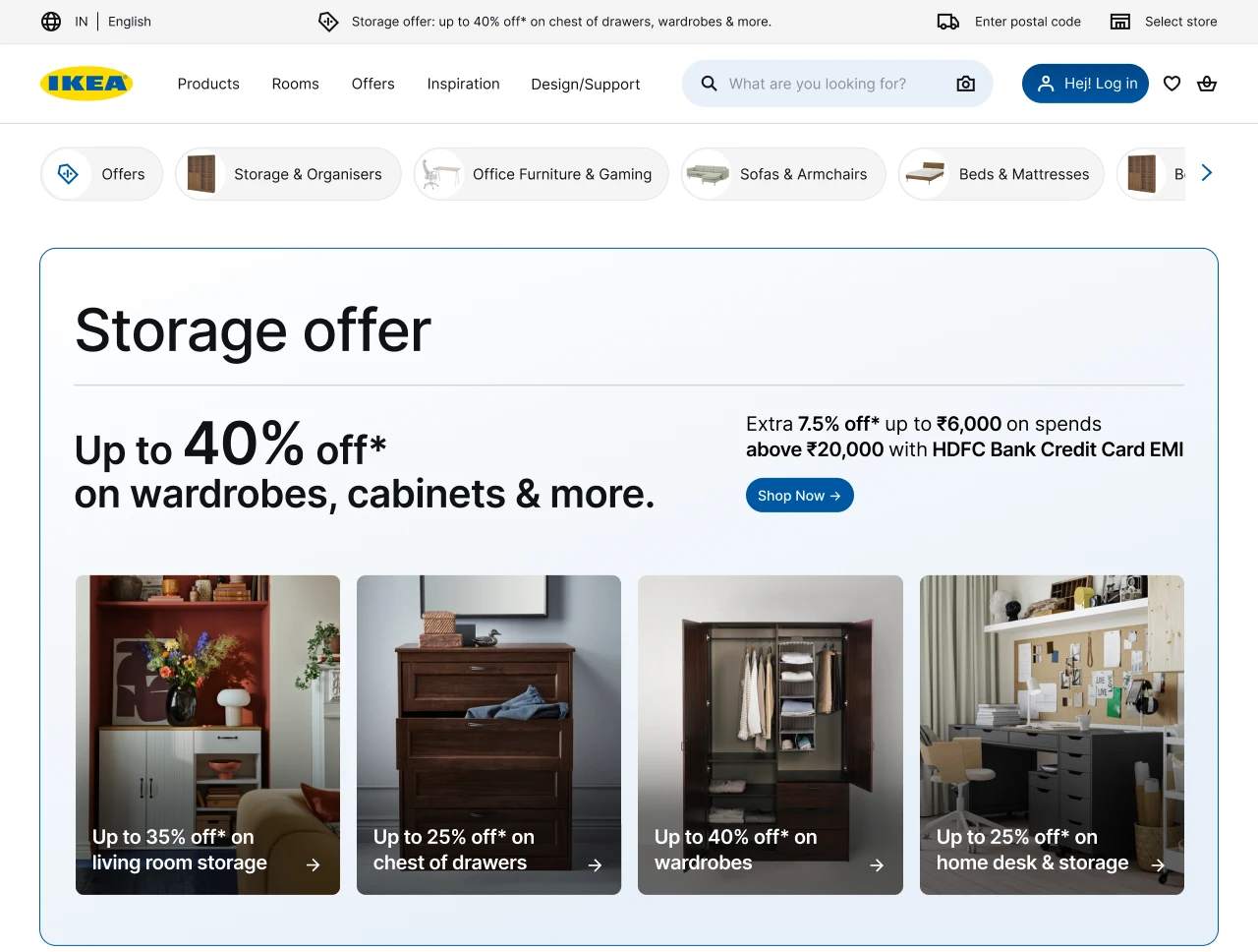
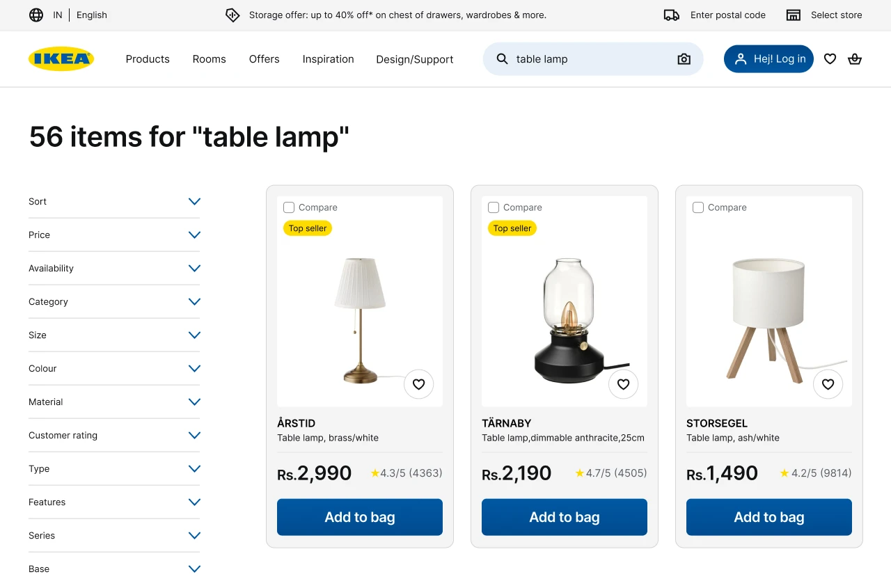
A restrained system that holds more, not less.
Hierarchy comes from type instead of boxes, borders replace shadows, whitespace does the grouping, and one accent colour is used only for function. The same products and information, in a calmer, easier-to-scan layout.
Want to have acomplete look?
Check out the full projectNEXT UP